Concept maps (mental maps, mind maps) have been drilled into my psyche since elementary school. If thinking about complex systems is like juggling balls in your head, making a mental map feels like having invisible hands hold each ball in the air until you are ready to grab it.

At its most basic, concept maps are simple: concepts are nodes, relationships between them are “edges” or links between them, and bam, you get a network graph and call it a concept map.
I first experimented with concept maps as a real-time, public record of research years ago as a part of the labSquared project (which I will likely revisit extensively through this medium in writings to come). The idea of the project was to reimagine what a research lab could be like, and if I was already toying with open lab notebooks, I might as reimagine how information was presented in them by taking advantage of the dynamic, interactive, and updateable nature of the modern Web in ways that static text and drawings never could. Five years later, as I begin preparing to start an actual research lab, I decided to put my money (or effort) where my mouth was (or had been).
The idea of using concept maps to communicate scientific research in progress fits right in with their original intended use. Modern concept maps have their origins during the 1970s in the research group of the late Joseph D. Novak, professor of education and biological sciences in the Department of Plant Science at Cornell University (poetically, the same institution I will be joining to start MsEE Lab). Novak proposed concept maps as a pedagogical tool to visualize the way in which students understood scientific concepts. Scientific research is, at its core, a learning process much like that of any student, so bringing concept maps to bear on research in progress is a natural next step.
Concept maps reflect our imperfect understanding back at us, showing us errors that we wouldn’t normally notice while juggling all the balls in our heads. It allows us to zoom in and examine our understanding piece by piece—ball by ball—without dropping all the balls, and then zoom out to observe the delicate balance of their connections, find any gaping holes between them, and glean insight from a birds-eye-view epiphany.
This almost haptic nature of zooming in and out on concept maps is not quite achieved on a piece of paper or a static image. Of course, you can add extra information to nodes, but if you’re anything like me, the piece of paper starts getting busy very quickly. The delicate balance of the connections between the nodes gets crowded out by the text, and the balls come tumbling down. It also makes things hard to update.
There are plenty of software tools that allow you to make interactive concept maps to get around these issues. However, I wanted to make my own, because I felt like procrastinating and making something that looked pretty. The web tools available since the framework I hacked together in 2020 have also progressed quite a bit: the original lab2web used JSNetworkX, a piece of software last updated a decade before the time of writing this text, and the result I came up with for lab2web wasn’t exactly aesthetically pleasing. In the years since, I had come across sigma.js (developed by le Sciences-Po médialab and OuestWare, merci bien) and used it to map out protein-protein interactions in malaria parasites. Sigma.js received a significant facelift recently, so I decided to take it for another spin.
I think things came out fairly well: I present to you:
MsEE Lab’s Projectome
(I apologize—as a biologist, my professional defect is to look at any collection of things and stick an “-ome” on it).
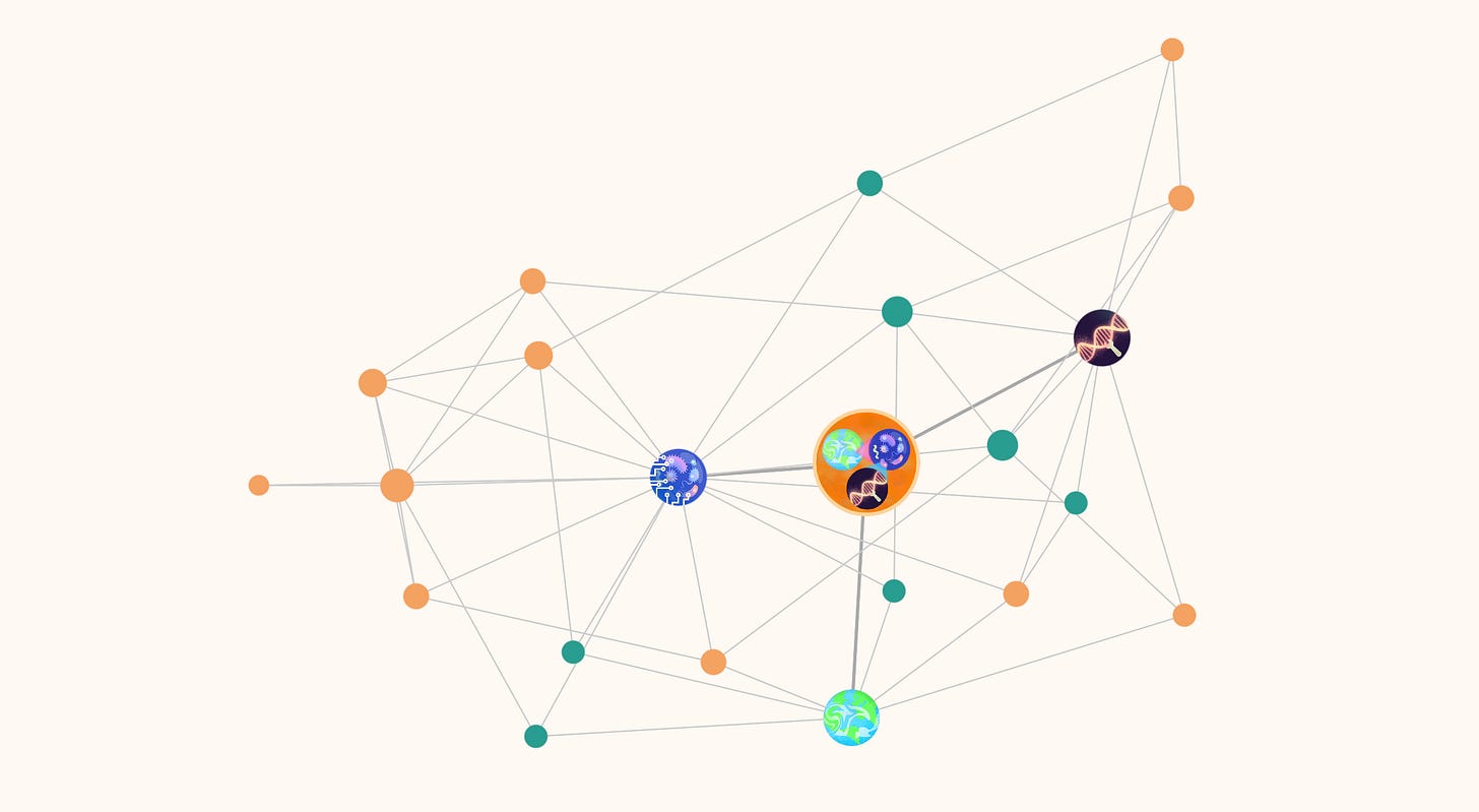
Large, illustrated nodes depict the lab’s main areas of research (I disabled the illustrations on mobile browsers for performance reasons; they’ll appear dark red).
Smaller, colored nodes are projects, understood as drivers or motivators of research. These come in two types: those aimed at answering questions (in green) to understand phenomena and those aimed at building tools (in orange) capable of achieving objectives (I might revisit this distinction in a future piece of writing). Click on a node to reveal information about the progress, participants, and products of a project on the sidebar and highlight all its connections on the map.
Connections between projects denote direct synergies. Connections to research areas denote belonging.
I am left with some questions after this exercise: I realize it’s tricky to demarcate where a project starts and another begins. Some nodes feel redundant with each other, some nodes contain each other in a way that a concept map of this nature can’t really portray. Relatedly, a “direct synergy” connecting two projects feels like an arbitrary concept, and the difference between having two synergistic projects or a single, broader project can be hard to distinguish. Finally, the choice to display four illustrated nodes denoting research areas is deliberate and arbitrary due to the initial focus I am proposing for MsEE Lab, but the reality is that many other fields of research could be integrated into the concept map—“infectious disease”, for starters. I’ll delve into the framing of MsEE Lab’s research areas in a future text.
Although I didn’t go ahead and try to make a full user API like I did with lab2web, hopefully the code is easy enough for anybody interested to adapt (reach out if you need help!). The map pulls from a csv table file containing all the information, which allows me to easily update the network with new nodes, connections, and information as it develops without reworking the code. As MsEE Lab’s research projects progress, information from nodes on the map will link back to research updates on this substack.
En fin! Go on and explore.
* * *

